Roof Lantern Colours: Choosing the Right Finish for Your Extension
Roof lanterns are available in any RAL colour, but which finish works best? Here's the guide to choosing a colour that ages well and suits your extension.
A roof lantern colour decision feels different from a door colour decision, because the lantern is above you, seen against the sky and the ceiling simultaneously, and its colour affects both the exterior appearance of the roof and the internal quality of the light. Here's how to think about it.
The Two Viewing Contexts
A roof lantern is seen from two angles: from outside the building (the external colour against the roofline) and from inside the room (the internal colour against the ceiling and sky). These are different contexts, and they sometimes call for different colours, which is why dual-colour specification is particularly relevant for roof lanterns.
The Most Popular Choices
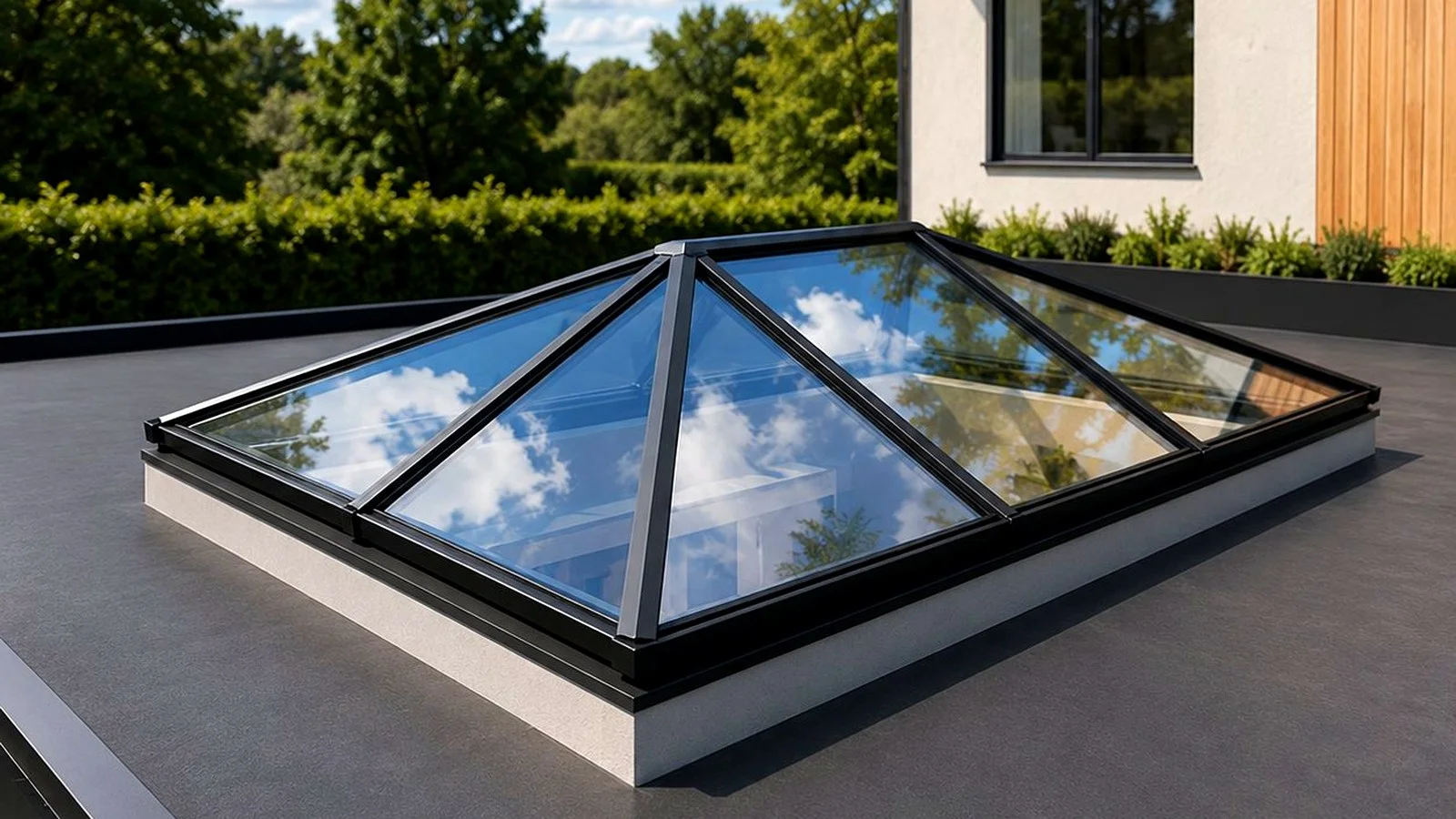
Anthracite Grey (RAL 7016), outside, White (RAL 9010), inside
The most popular dual-colour combination for roof lanterns in contemporary UK architecture. Anthracite grey on the exterior matches the bifold doors and window frames and reads as a coherent architectural element from outside. White on the interior reflects light maximally and recedes against a white-painted ceiling, making the lantern appear to float rather than impose. This combination works in almost any context, contemporary render, brick, or timber-clad exteriors.
All Anthracite Grey (RAL 7016)
For a more graphic, architectural statement, dark frames visible from inside against the sky. Works particularly well in spaces with dark or dramatic interior finishes: dark kitchen cabinetry, concrete floors, dark joinery. The contrast between the dark frame and the bright sky creates a strong visual tension that can be very beautiful.
All White (RAL 9010)
The traditional choice for orangery-style extensions and period properties. White frames read as part of the ceiling rather than as a separate architectural element, the lantern disappears into the room. Maximum light reflection from the white powder coat adds brightness. Works best in rooms with white or light-coloured ceilings where the lantern should be elegant rather than dramatic.
Black (RAL 9005)
The most striking choice, bold, graphic, contemporary. Black frames visible inside create a strong grid of shadow against the light sky. Increasingly popular in high-design kitchens and living spaces. Best on exteriors with white render or pale cladding where the contrast is high.
Should the Lantern Match the Doors?
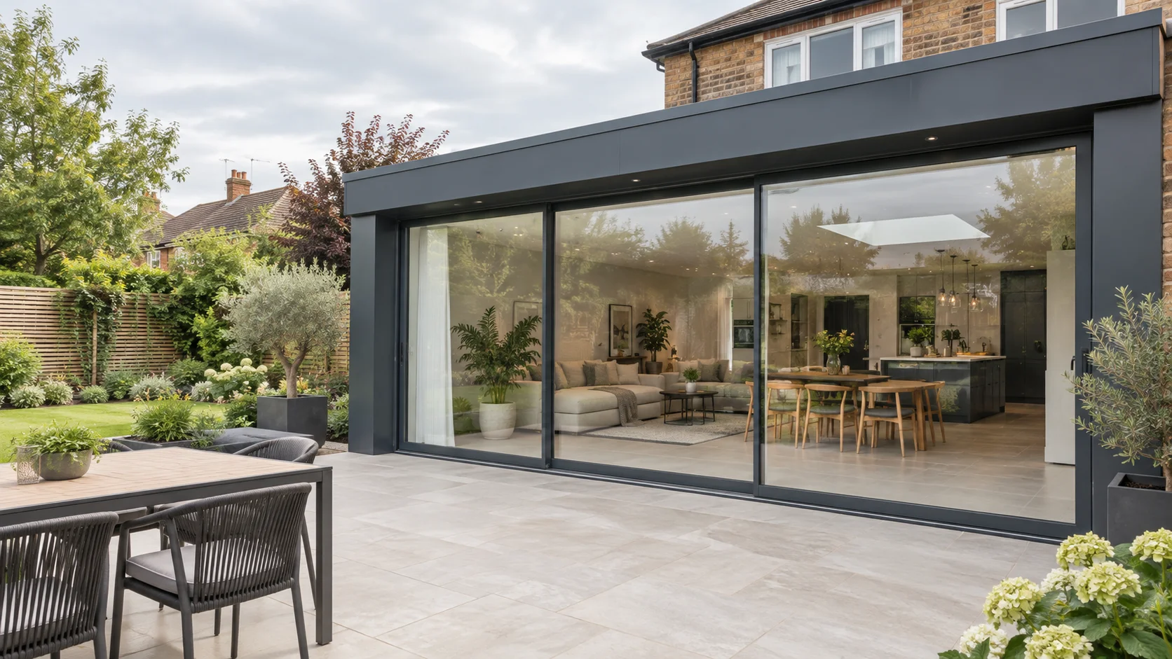
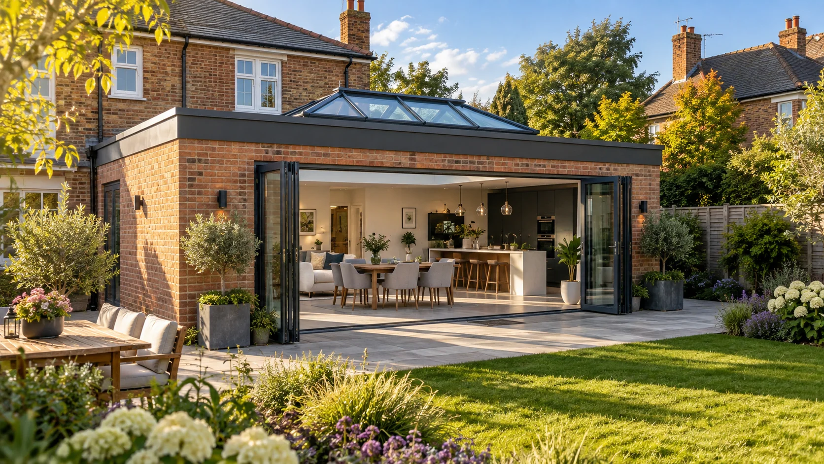
Generally, yes, or at least, the exterior colour of the lantern should relate coherently to the frame colour of the bifold or sliding doors below it. A consistent anthracite grey on doors, window frames, and lantern creates a unified design language across the extension. A mismatched lantern frame colour reads as an error.
The internal colour of the lantern is more flexible, it can differ from the external frame colour (dual-colour specification) to suit the interior palette.
Practical Considerations
White and light-coloured lantern frames, seen from below against a bright sky, can create more glare than dark-framed equivalents. Dark frames visible from inside absorb light and define the glazed panels more clearly. This is a minor practical consideration but worth noting for rooms where screen use (televisions, computers) requires controlled light.
For the exterior, dark colours (anthracite, black) absorb more solar heat than light colours, which can slightly increase the temperature within the lantern structure, relevant mainly in sealed roof lanterns. In practice, quality glazing with a solar control coating manages this effectively.
Explore more
Author at Smartaview, writing about aluminium glazing, home improvements and the buying process.