Aluminium Door Colours That Age Well: A Long-Term Guide
Some aluminium door colours are closely tied to short-lived trends, while others remain attractive for decades. Discover which finishes age well and how to choose a colour you will still appreciate in years to come.
Choosing the colour of your aluminium doors can feel like a relatively small part of a renovation, but it is a decision you may live with for several decades.
Kitchen cabinets can be repainted, walls can change colour and furniture can be replaced. Powder-coated aluminium doors are intended to remain in place for much longer, so the finish needs to work with both your home today and any changes you may make in the future.
That does not mean every property should use the same safe neutral. A distinctive colour can be extremely successful when it genuinely suits the architecture. The aim is to understand the difference between a finish that belongs to your home and one selected mainly because it is fashionable at the time of ordering.
This guide explores the aluminium door colours with the strongest long-term appeal, the finishes that require more careful consideration and the practical steps that will help you make a confident choice.
What Makes an Aluminium Door Colour Timeless?
A timeless colour is not necessarily plain or conservative. It is a colour that continues to make sense when the surrounding interior, landscaping and design trends change.
Colours tend to age well when they:
-
Complement the permanent materials used on the property
-
Have an established history in architecture
-
Work with more than one interior colour scheme
-
Do not depend on a highly specific short-term trend
-
Suit the amount of natural light around the opening
-
Coordinate with nearby windows, roof details and metalwork
Neutral does not always mean timeless, and bold does not always mean temporary. Black can be a strong statement while still having decades of architectural precedent. A muted fashionable neutral may appear safer but become closely associated with a particular period.
Start with the Permanent Parts of Your Home
The most reliable way to choose a long-lasting door colour is to start with the materials that are least likely to change.
These may include:
-
Brickwork
-
Natural stone
-
Roof tiles or slate
-
External cladding
-
Existing aluminium windows
-
Gutters, fascia and other roofline details
-
Permanent interior flooring
Wall paint and soft furnishings may change several times during the lifespan of the doors. Brick, stone and roof materials normally remain for far longer.
A frame colour that relates naturally to those permanent materials is less likely to feel misplaced after the next interior renovation.
Anthracite Grey: RAL 7016
Anthracite Grey has become one of the most widely selected colours for aluminium doors and windows in the UK.
Its popularity is partly connected to contemporary design, but it also works because it is unusually versatile. It sits between a neutral grey and a strong architectural dark, allowing it to provide definition without creating the full contrast of black.
Anthracite grey works well with:
-
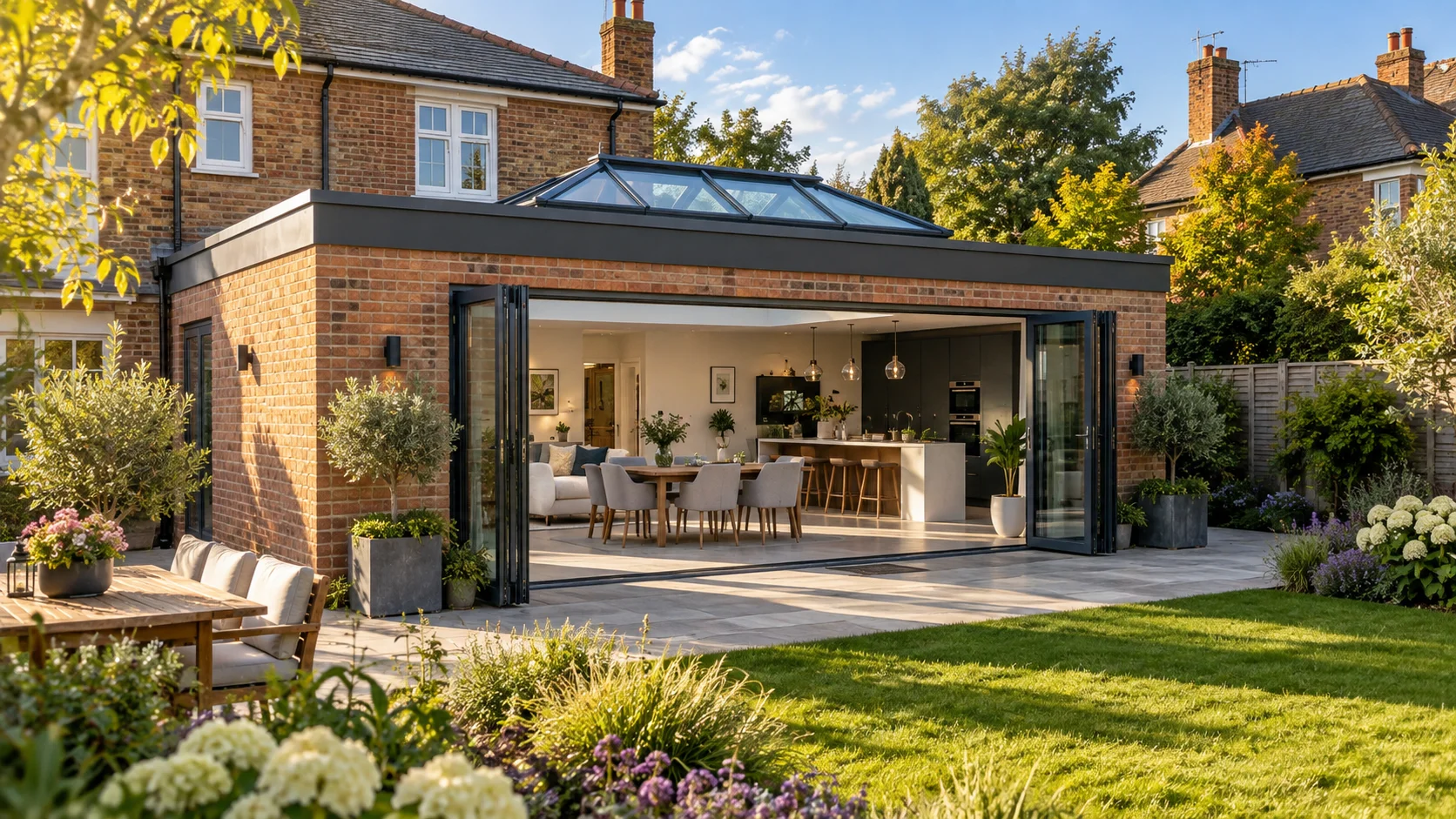
Red and buff brick
-
White or coloured render
-
Natural stone
-
Timber cladding
-
Slate roofs
-
Contemporary and transitional architecture
It is dark enough to make aluminium frames look slim and precise, but softer than jet black when used across a large glazed elevation.
RAL 7016 is likely to remain a dependable choice because it is no longer limited to one particular style of property. It now appears on extensions, new builds, renovated cottages and traditional brick homes.
When Anthracite Grey Works Best
It is particularly effective where other dark elements already appear on the property, such as roof tiles, downpipes, cladding trims or window frames.
It can feel less successful where the house uses predominantly warm cream, golden stone or soft traditional detailing. In those settings, a warmer grey may create a more natural relationship.
Jet Black: RAL 9005
Black aluminium frames create a bold, graphic and deliberately architectural appearance.
Although black can feel dramatic, it has a long history in steel windows, industrial buildings, traditional metalwork and modernist architecture. That established precedent gives it more longevity than many trend-led colours.
Black works especially well with:
-
White or pale render
-
Contemporary extensions
-
Steel-look internal glazing
-
Minimal kitchens using black hardware
-
Industrial-inspired interiors
-
Properties with matching black windows and roof details
Black is more visually dominant than anthracite. Across a multi-panel bifold door, every vertical frame section becomes clearly defined.
This can look excellent where the grid is intended to form part of the design. It may feel heavy in a compact room with many dark-framed windows and doors.
Long-Term Considerations for Black
Black is less flexible if you later repaint or re-render the property using very warm colours. It also shows pale dust, pollen and dried water marks more visibly than many mid-tone finishes.
Choose it because the strong contrast genuinely suits your architecture, not simply because black frames are currently prominent in design imagery.
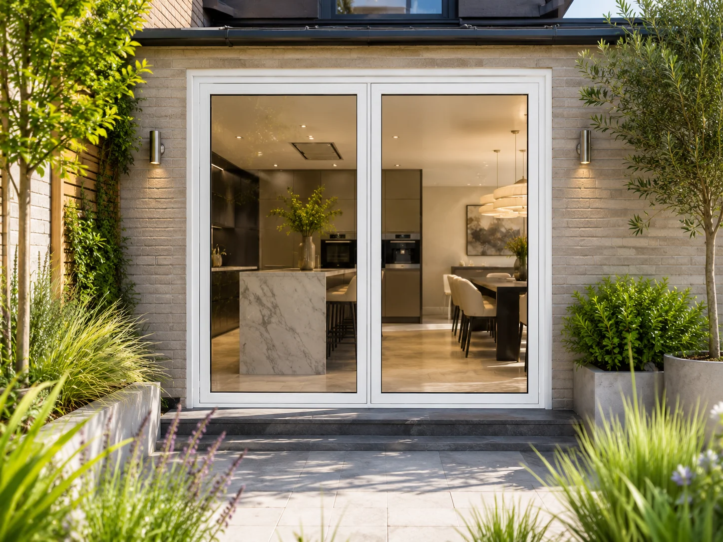
White: RAL 9010 or RAL 9016
White is one of the most enduring frame colours available.
It has been used on doors and windows across traditional, suburban, coastal and contemporary properties for generations. It rarely becomes completely unfashionable because it is closely associated with clean architectural detailing rather than one specific design movement.
White aluminium frames work well with:
-
Period and traditional properties
-
White or cream render
-
Light internal walls and ceilings
-
Coastal and Scandinavian-inspired interiors
-
Existing white windows
White reflects light and can help the inside of a room feel brighter. It also makes the aluminium frame less visually dominant against pale internal walls.
Choosing the Right White
RAL 9010 Pure White has a slightly warmer appearance, while RAL 9016 Traffic White is usually perceived as cleaner and brighter.
The difference can be noticeable when the frame sits directly beside painted walls, white kitchen units or existing windows.
Compare physical samples against the surrounding materials before ordering. A cool white door beside warm white render may look unintentionally blue or grey.
Practical Considerations
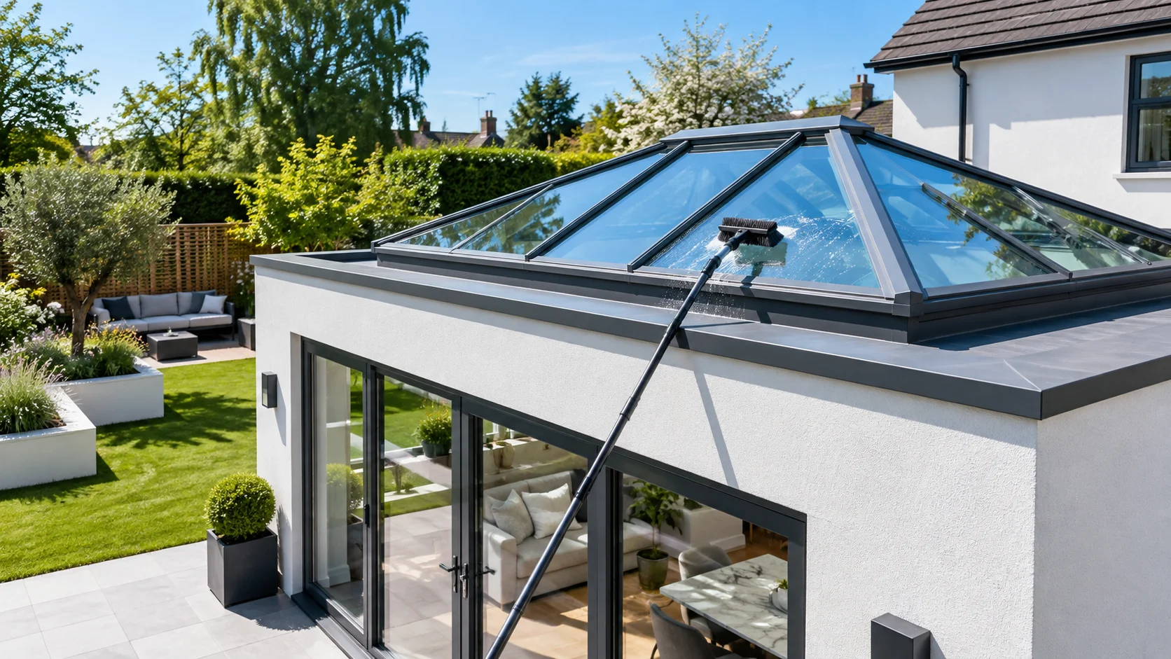
White frames may show dirt, algae and traffic pollution more readily, particularly in urban or shaded environments. This does not make them less durable, but they may need more frequent cleaning to retain their appearance.
Warm Grey: RAL 7030, RAL 7032 or RAL 7044
Warm greys provide an alternative for properties where anthracite feels too dark and white feels too sharp.
Colours such as Stone Grey, Pebble Grey and Silk Grey contain warmer undertones that coordinate naturally with stone, timber, cream render and softer interior palettes.
Warm greys work particularly well with:
-
Cottages and rural properties
-
Natural stone elevations
-
Oak and timber cladding
-
Scandinavian-inspired interiors
-
Soft neutral kitchens
-
Landscaped garden settings
These shades tend to blend with their surroundings rather than creating a strong frame around the glazing.
They are likely to age well where they are selected in response to the building materials rather than because a specific beige-grey tone is fashionable.
Be Careful with Undertones
Warm greys can appear beige, green or pink depending on the light and nearby materials.
A sample that looks neutral in a showroom may appear much warmer beside blue-grey stone or noticeably greener against red brick.
Always assess these colours at the property.
Graphite and Black Grey
RAL 7024 Graphite Grey and RAL 7021 Black Grey provide darker alternatives to Anthracite Grey.
They can offer a slightly more neutral or dramatic appearance while retaining the versatility of a dark architectural frame.
These colours work well when:
-
Anthracite appears too blue against the property
-
Black feels excessively strong
-
The roof and external metalwork already use deep graphite tones
-
A contemporary but understated finish is preferred
The differences between dark greys can appear minor on a printed chart but become much more obvious across a complete door frame.
Dark Green
Deep and muted greens have a long association with traditional joinery, rural buildings and British architecture.
A well-chosen dark green can therefore age more gracefully than a brighter trend colour.
Green aluminium doors can complement:
-
Red brick
-
Natural stone
-
Timber cladding
-
Period properties
-
Garden-facing elevations
-
Rural landscapes
Muted grey-green finishes tend to be easier to live with than highly saturated greens.
For a front door, a deeper green can provide individuality without dominating the complete elevation. Across a full set of bifolds or windows, the colour should be tested carefully because the larger surface area makes it much more prominent.
Navy and Deep Blue
Dark blue has an established place in traditional front-door design and coastal architecture.
It can age well where it relates directly to the property, particularly when combined with:
-
White render
-
Red brick
-
Slate roofing
-
Coastal materials and landscaping
-
Cool grey or white windows
Blue is generally easier to use on an entrance door than across every window and garden door on a house.
Very bright or strongly saturated blues may become closely associated with a particular period, while dark navy and grey-blue shades have a more established architectural quality.
Bronze, Gunmetal and Metallic Finishes
Bronze and metallic-inspired powder coatings can provide warmth and depth that standard greys do not offer.
They work particularly well with:
-
Red and brown brick
-
Natural stone
-
Timber cladding
-
Brass or bronze interior hardware
-
Art Deco and mid-century influences
-
Premium entrance doors
These finishes can age well when they draw on traditional architectural metals rather than imitating a short-term decorative trend.
However, metallic coatings vary considerably. Some are subtle and mineral-like, while others contain more visible sparkle or colour variation.
Always view a coated aluminium sample from several angles and in different lighting conditions.
Natural Aluminium and Silver Finishes
Silver, anodised-look and natural aluminium finishes have strong associations with commercial and modernist architecture.
They can remain appropriate for:
-
Minimal new-build properties
-
Industrial conversions
-
Homes containing stainless-steel or zinc details
-
Architectural glazing intended to appear light and technical
These finishes are less universally adaptable than grey, black or white, but they can remain timeless within the right architectural context.
They are less likely to work successfully where the property relies on warm traditional materials and decorative joinery.
Colours to Approach More Carefully
No colour is automatically wrong. A distinctive finish can be the perfect choice when it reflects the architecture or the homeowner’s genuine long-term preferences.
However, some categories are more likely to feel connected to a particular trend.
Highly Fashionable Earth Tones
Terracotta, clay, muted brown and warm earthy shades can look excellent with contemporary render, timber and natural interiors.
The risk is that a very specific tone may become associated with a particular design period.
Use these colours confidently where they relate to permanent materials such as brick, tiles or surrounding landscape. Be more cautious if the finish is being selected mainly to match furniture, paint or a current social-media trend.
Bright Saturated Colours
Strong reds, yellows, blues and greens can create memorable entrance doors.
They are harder to use across large bifold, sliding or window installations because they dominate the elevation and restrict future decorating choices.
A bright colour may work best as a controlled accent on one entrance door rather than the default finish for every aluminium product.
Mid-Tone Browns
Some brown finishes can coordinate beautifully with timber and brick. Others may appear caught between a traditional wood effect and a contemporary dark frame.
Test mid-tone browns carefully against the building materials. The wrong undertone can make a new aluminium system appear dated sooner than a cleaner neutral or darker bronze.
Very Pale Fashion Neutrals
Pale beige, putty and pink-grey colours can look sophisticated, but subtle trend-based undertones may become more noticeable when fashions change.
They also risk clashing with replacement render, new kitchen finishes or neighbouring materials in the future.
Trend-Led Does Not Always Mean Short-Lived
Many colours now considered timeless were once fashionable choices.
Anthracite grey became prominent through contemporary architecture before becoming an established residential standard. Black steel-look glazing also moved from an architectural niche into mainstream interiors.
The difference is whether the colour has wider architectural logic.
Ask:
-
Does the colour have an established history in buildings?
-
Does it work with the permanent materials on this property?
-
Would I still choose it without seeing it in current design imagery?
-
Can the interior be redecorated without clashing with it?
-
Does it suit both sunny and overcast conditions?
A current trend can still become a long-term choice when the answers remain positive.
Dual Colour: A Practical Long-Term Option
A dual-colour finish allows the internal and external faces of the aluminium frame to use different colours.
A common example is:
-
Anthracite grey externally
-
White internally
This provides a dark contemporary exterior while keeping the interior light and easy to coordinate with future decorating schemes.
Other useful combinations include:
-
Dark green externally with warm white internally
-
Black externally with warm grey internally
-
Bronze externally with a softer neutral internally
-
Anthracite externally with black internally for a more architectural room
Dual colour is not a way to update one face independently after manufacture. Both finishes are applied as part of the original production process.
Its advantage is that each side can be selected for its own environment, reducing the need to compromise between the exterior and interior.
Should Every Door and Window Match?
Using one colour across bifolds, sliding doors, windows and entrance doors creates visual consistency.
This is usually the safest approach where several products appear on the same elevation.
However, not every item must match exactly. An entrance door can act as a deliberate accent while the windows and garden doors use a quieter neutral.
A coordinated scheme might use:
-
Anthracite windows and bifold doors with a dark green entrance door
-
Black external glazing with bronze internal glazed doors
-
Warm grey windows with a matching frame and contrasting front-door panel
The important distinction is between an intentional contrast and an approximate mismatch.
Two greys that are nearly—but not quite—the same can look less considered than two clearly different but complementary colours.
Why Matching RAL Numbers May Still Look Different
Specifying the same RAL number is important, but it does not always produce an invisible match between products.
Differences may result from:
-
Matt, satin, gloss or textured finishes
-
Different powder-coating manufacturers
-
Different aluminium preparation processes
-
Normal production-batch variation
-
The angle and shape of each frame section
-
The direction of sunlight
-
The age and weathering of existing frames
When coordinating several products, record the full specification rather than only the colour name.
This should include:
-
The RAL or manufacturer reference
-
The gloss level
-
Whether the finish is smooth or textured
-
The internal and external colours
-
The hardware and hinge finishes
Matt, Satin or Textured?
The surface finish influences how a colour ages visually.
Matt Finishes
Matt coatings provide a modern low-reflection appearance and can make dark colours feel softer.
They are versatile and unlikely to appear overly decorative, making them a dependable long-term option.
Satin Finishes
Satin provides a subtle reflection and can be easier to wipe clean than a strongly textured coating.
It sits between contemporary matt and more traditional gloss finishes.
Gloss Finishes
Gloss makes colours appear stronger and more reflective. It can suit traditional entrance doors but may feel more dominant across large areas of glazing.
Fine scratches and surface imperfections may also be more noticeable under direct light.
Textured Finishes
Textured powder coating adds depth and can hide light marks or fingerprints. It often gives dark aluminium a substantial architectural appearance.
However, texture is itself part of the design language. A heavily textured coating may be more difficult to coordinate with future replacement products than a standard matt or satin finish.
How the Colour Will Physically Age
Visual timelessness is only part of the decision. The finish must also remain physically presentable.
A quality powder-coated aluminium surface is designed to resist normal weather exposure, but its longevity depends on:
-
The preparation of the aluminium
-
The coating quality and thickness
-
The level of ultraviolet exposure
-
Salt, pollution and airborne contaminants
-
The frequency and method of cleaning
-
Whether the correct coating was specified for the location
Strong colours can make gradual fading or chalking more visible if a lower-quality coating is used.
Ask what finish and guarantee apply to the specific product rather than assuming every powder-coated frame offers identical durability.
Coastal Properties Need Additional Consideration
Salt and wind create a more demanding environment for aluminium doors and their hardware.
For coastal or highly exposed properties, ask whether the system requires:
-
An enhanced or marine-grade coating
-
Corrosion-resistant handles, hinges and locks
-
More frequent cleaning
-
A specific maintenance schedule to preserve the guarantee
Mid-tone colours can sometimes disguise salt deposits more effectively than black or white, but the appearance of dirt should not determine the technical coating specification.
Regularly washing salt from the frames is important regardless of the chosen colour.
Which Colours Are Easiest to Maintain?
Every aluminium finish needs occasional cleaning, but some colours hide everyday marks better than others.
Mid-Tone Greys
Anthracite and warmer mid-to-dark greys generally disguise light dust, rain marks and minor surface dirt reasonably well.
Black
Black can show pale dust, pollen, dried rainwater and fingerprints clearly.
White
White can reveal road dirt, algae and pollution, particularly around drainage channels and lower frame sections.
Textured Neutrals
Textured grey, bronze and neutral finishes can conceal minor marks, although dirt may collect within the fine surface texture.
Maintenance should never be the only reason for choosing a colour, but it is worth considering for doors positioned beneath trees, beside busy roads or in exposed coastal locations.
Can Aluminium Doors Be Recoloured Later?
It may be technically possible to refinish aluminium frames, but it is not comparable to repainting a timber door.
A factory powder-coated finish is applied under controlled conditions before the door is assembled. Recoating an installed frame may require specialist preparation and spray application, and the final durability may differ from the original factory finish.
Challenges include:
-
Protecting the glass, seals and hardware
-
Preparing every visible and concealed surface
-
Maintaining a consistent finish around hinges and tracks
-
Avoiding interference with drainage and moving components
-
Potential implications for the product guarantee
It is therefore sensible to treat the original frame colour as a long-term decision.
View Samples in Real Conditions
A colour viewed on a phone, computer or printed brochure will not accurately reproduce a powder-coated aluminium finish.
Before deciding:
-
Request physical coated-aluminium samples.
-
Confirm the exact matt, satin, gloss or textured finish.
-
Hold the samples against the property’s brick, render, stone or cladding.
-
View them beside the internal walls, flooring and kitchen finishes.
-
Look at them in direct sunlight, shade and overcast conditions.
-
Compare them with existing windows, gutters and roof details.
-
Step back and assess the colour from a realistic distance.
A small dark sample can feel restrained when held in your hand but become a much stronger feature when repeated across six bifold panels.
Think About the Direction of the Elevation
The same colour can look different depending on the direction the doors face.
North-Facing
Cool, indirect daylight can make greys appear bluer and dark colours appear almost black.
South-Facing
Strong sunlight can reveal undertones and make colours appear lighter and warmer.
East-Facing
Colours receive stronger, clearer light during the morning and become softer later in the day.
West-Facing
Warm evening sunlight can emphasise brown, bronze, red or green undertones within a finish.
Assess the samples at the time of day when the room and garden are used most frequently.
Choose for the Type of Door
Bifold Doors
A bifold contains several repeated frame sections. Strong colours therefore create a more visible grid across the opening.
Anthracite, black and neutral greys tend to work well because they frame the glazing without introducing a highly decorative colour across every panel.
Sliding Doors
Sliding doors usually contain fewer, larger panes. Dark finishes can help slim meeting stiles visually recede against the glass.
Because the frame is less repetitive, distinctive bronze and metallic finishes can also work particularly well.
Front Doors
An entrance door provides more freedom to use colour as an accent.
Deep green, navy, bronze and stronger individual colours can remain successful because they are contained within one defined feature rather than repeated across the whole elevation.
Internal Glazed Doors
Black has strong long-term precedent for steel-look internal doors. Bronze, warm grey and white can provide alternatives where a softer or more decorative interior is preferred.
Internal colours should coordinate with permanent flooring, joinery and hardware rather than only the current wall paint.
A Simple Long-Term Colour Test
Before confirming the order, ask yourself:
-
Does this colour genuinely suit the property?
-
Does it coordinate with permanent materials?
-
Would it still work if the room were redecorated?
-
Am I choosing it because I love it or because it is currently fashionable?
-
Have I viewed a real sample outside?
-
Have I seen the colour in both direct light and shade?
-
Will it coordinate with future replacement windows or doors?
-
Am I comfortable with the amount of cleaning it may require?
If the finish still feels right after those questions, it is much more likely to remain a satisfying choice.
Which Aluminium Door Colours Age Best?
The finishes with the strongest long-term versatility are generally:
-
Anthracite Grey
-
Jet Black
-
Pure or Traffic White
-
Warm architectural greys
-
Deep muted green
-
Dark navy
-
Subtle bronze and gunmetal finishes
These colours have either a long architectural history or enough neutrality to work across changing styles.
That does not mean you must avoid distinctive colours. A bold finish chosen specifically for the architecture can age far better than a safe neutral that never suited the property in the first place.
The most timeless choice is the one that looks intentional, relates to the building and continues to work when the surrounding decoration changes.
Explore Aluminium Door Colours
Explore SmartaView’s aluminium door range to compare available bifold, sliding, entrance and internal door products.
Colour availability and dual-colour options vary between systems. Review the finish choices for the exact product you are considering and request a physical sample before approving your order.
Further reading
- RAL Colours for Aluminium Doors: A Complete Guide
- How Long Do Aluminium Doors Last? A Realistic Lifespan Guide
- Do Aluminium Doors Need Maintenance? The Honest Answer
Choosing a colour? See SmartaView's colours & finishes guide, then browse the range and price your doors online. Need a hand? Speak to our team.
Author at Smartaview, writing about aluminium glazing, home improvements and the buying process.